REBRANDING: ALDI
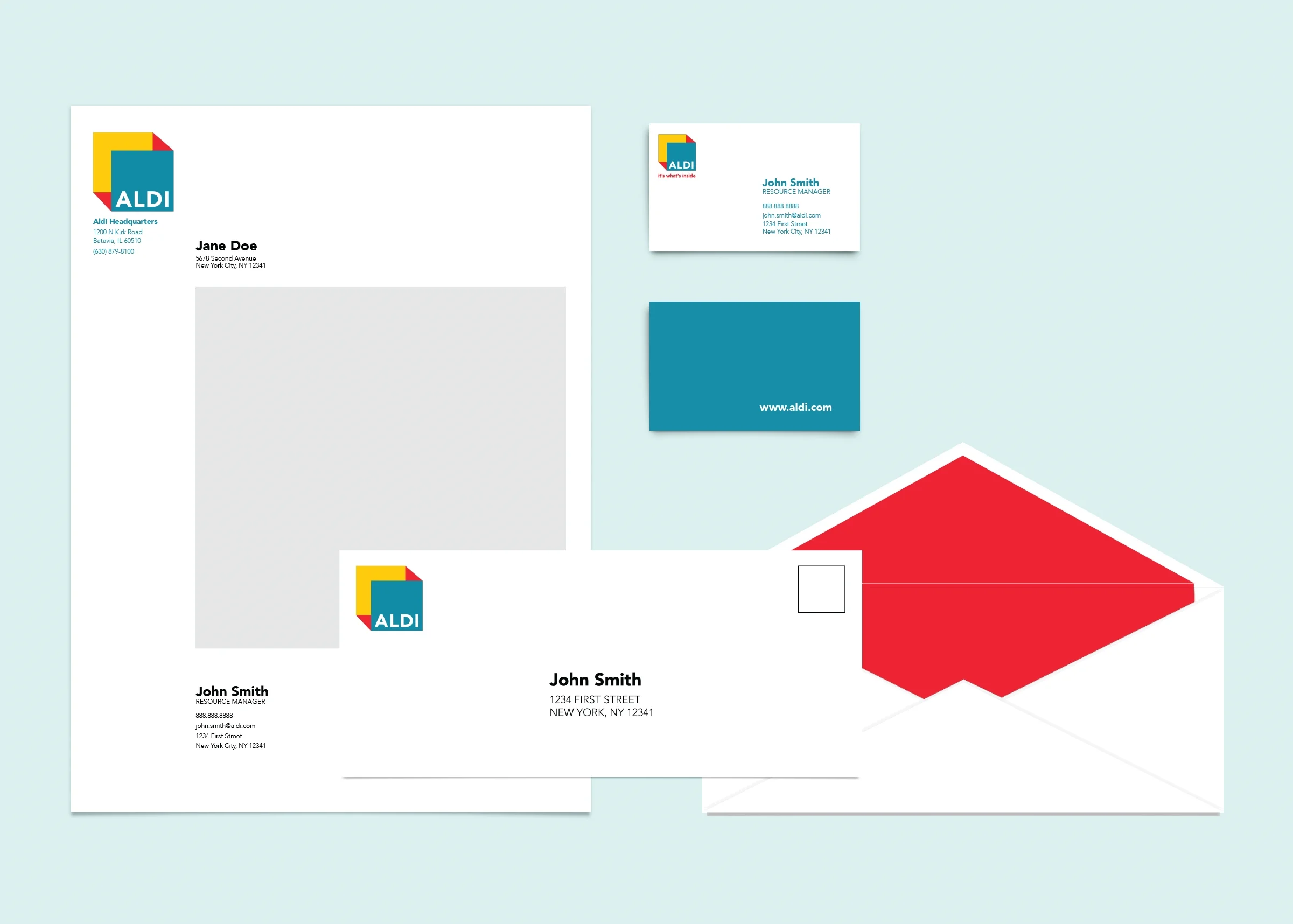
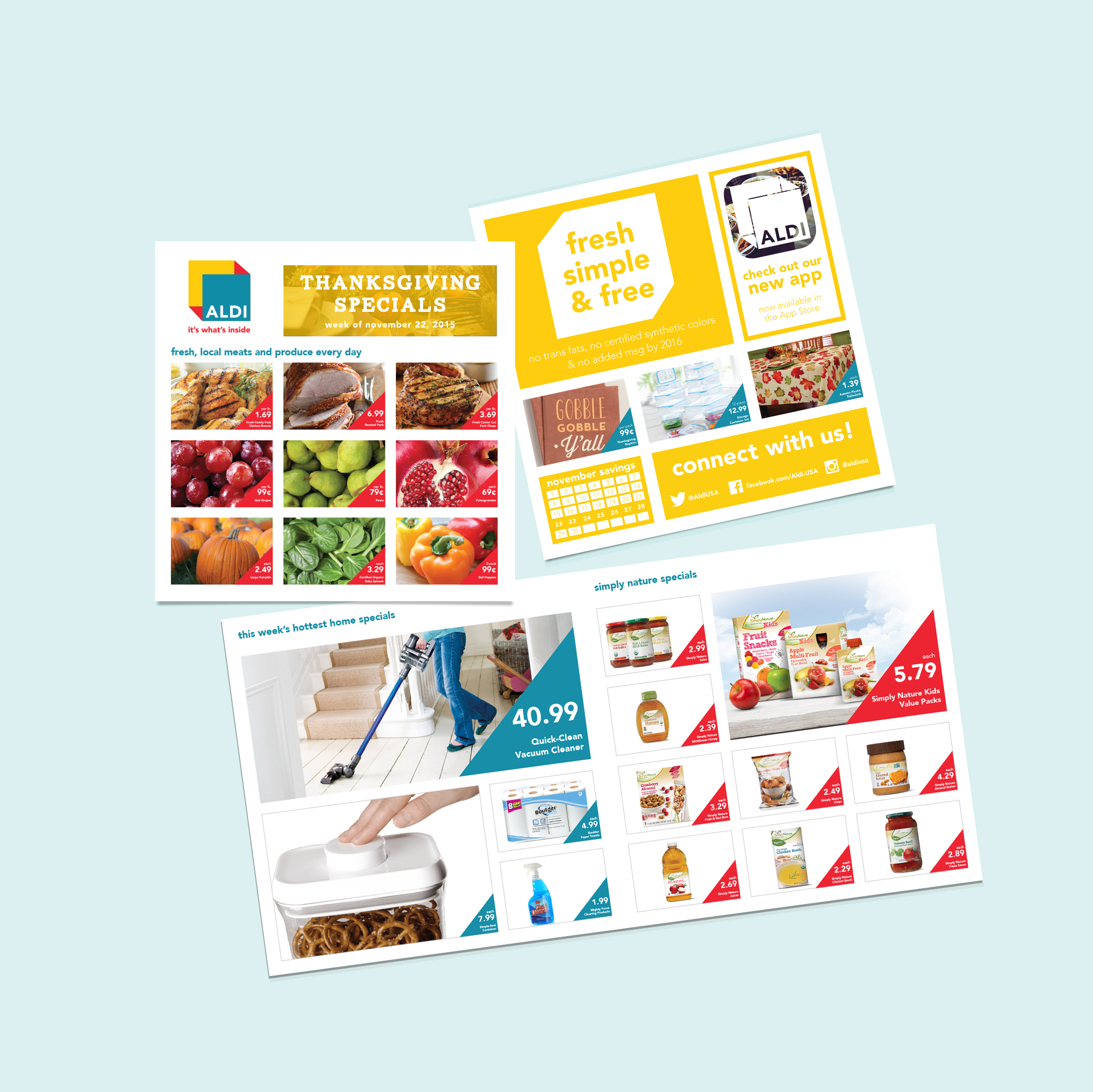
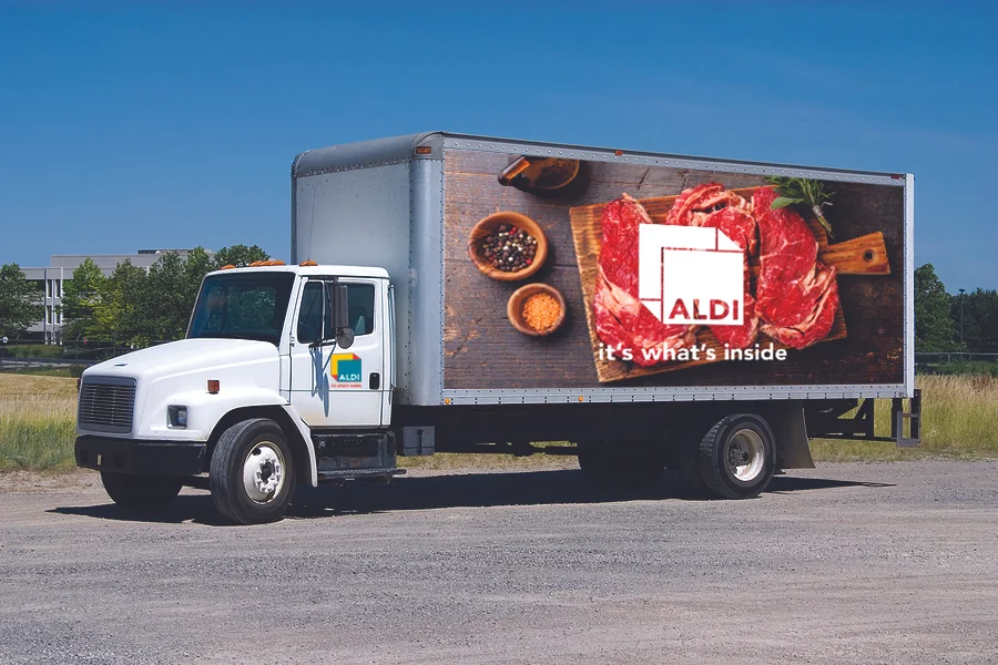
Aldi wanted to introduce fresh, everyday farmers markets in stores but keep the low prices. Aldi is repositioning itself as the only store in the grocery category that plays every role—manufacturer, supplier, distributor and point-of-sale. The new tagline, “it’s what’s inside," reflects the importance of what goes into Aldi products and Aldi's expertise.
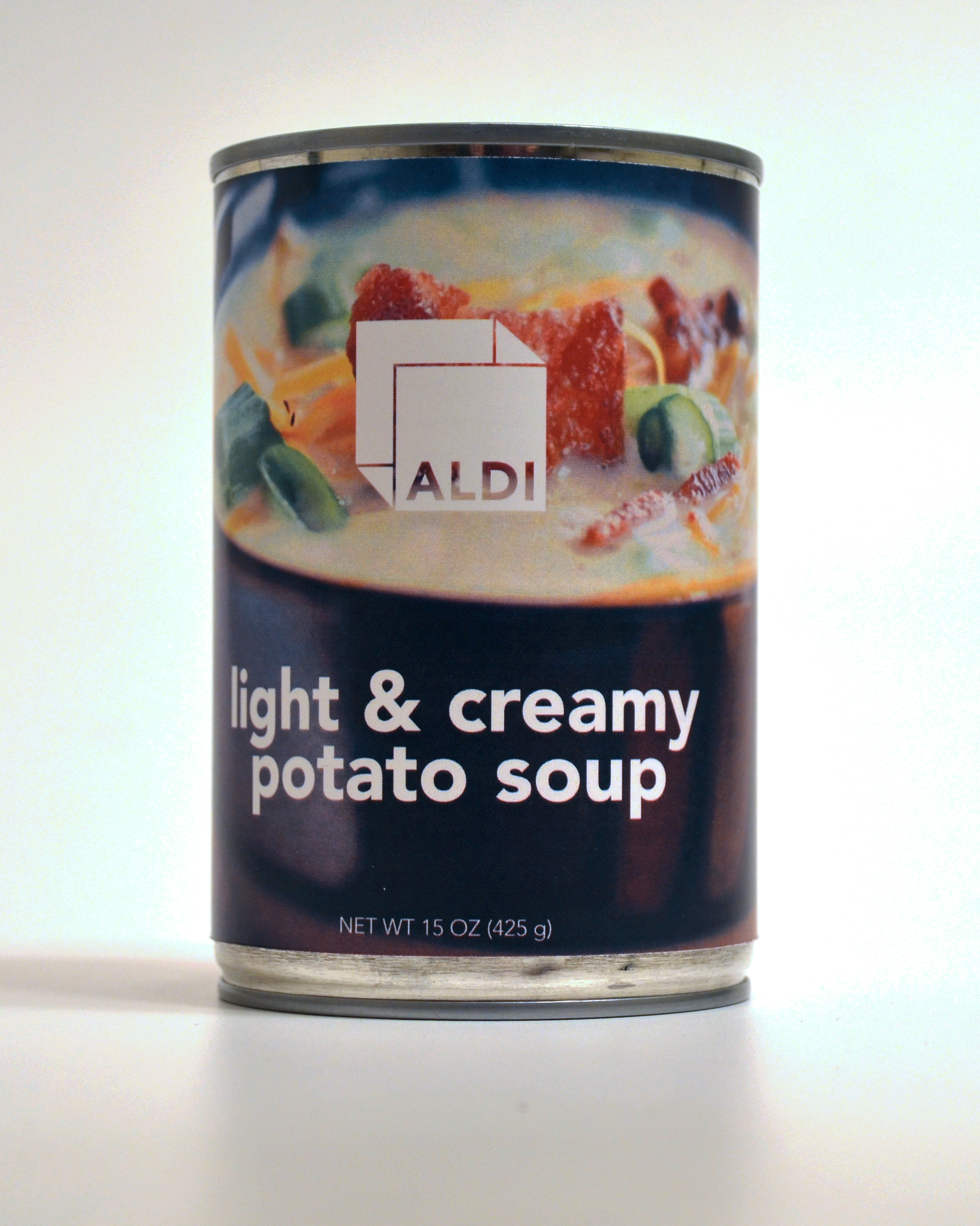
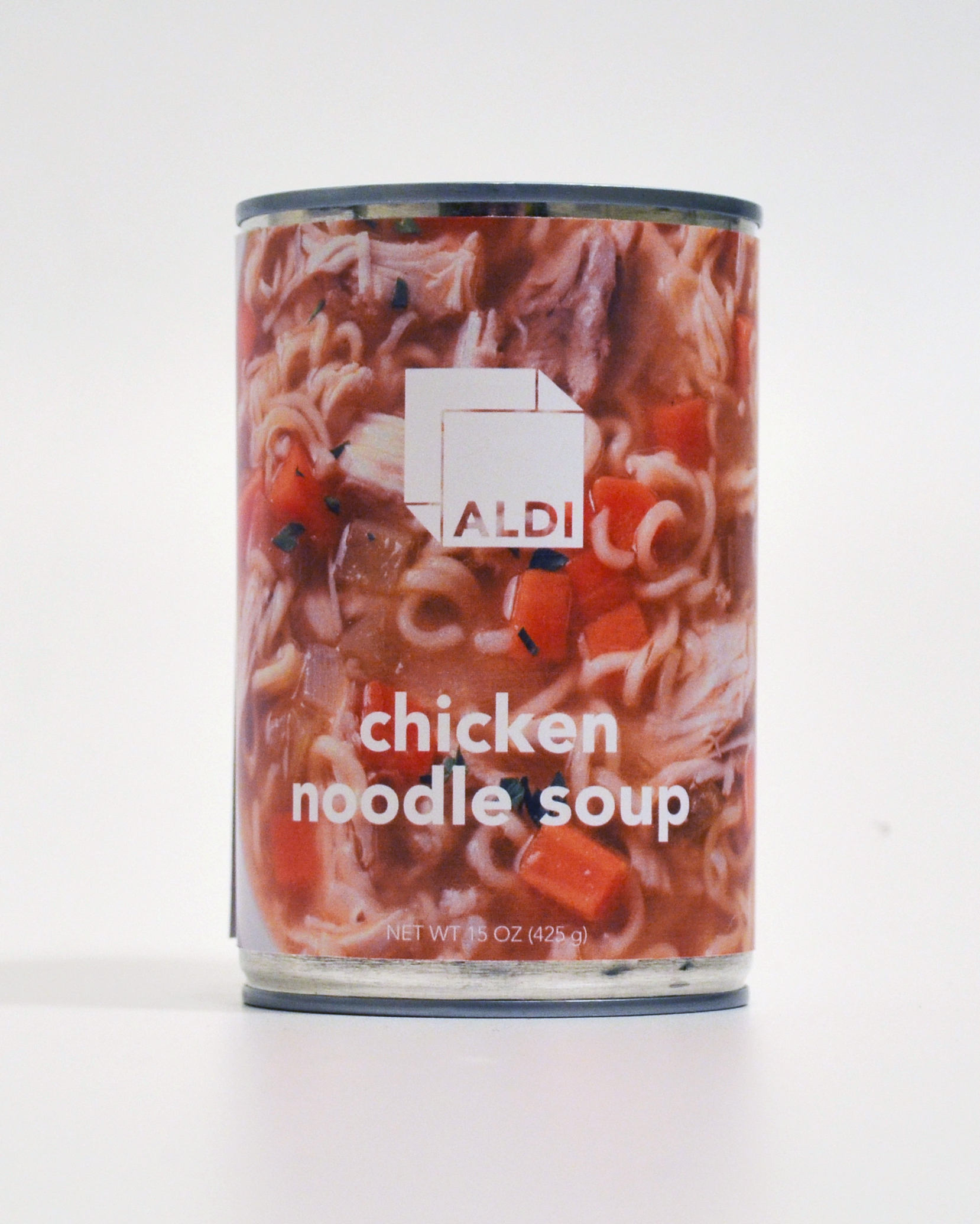
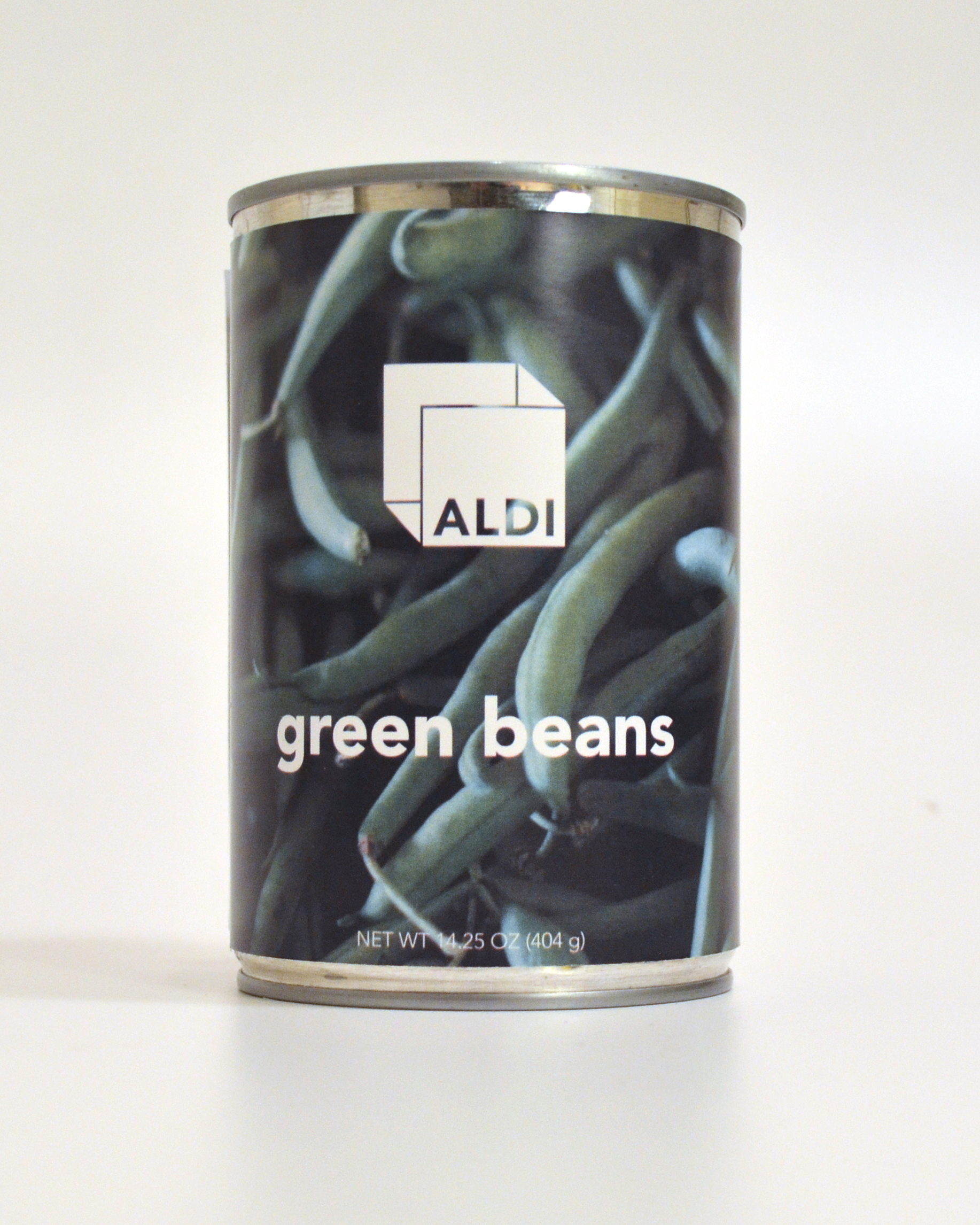
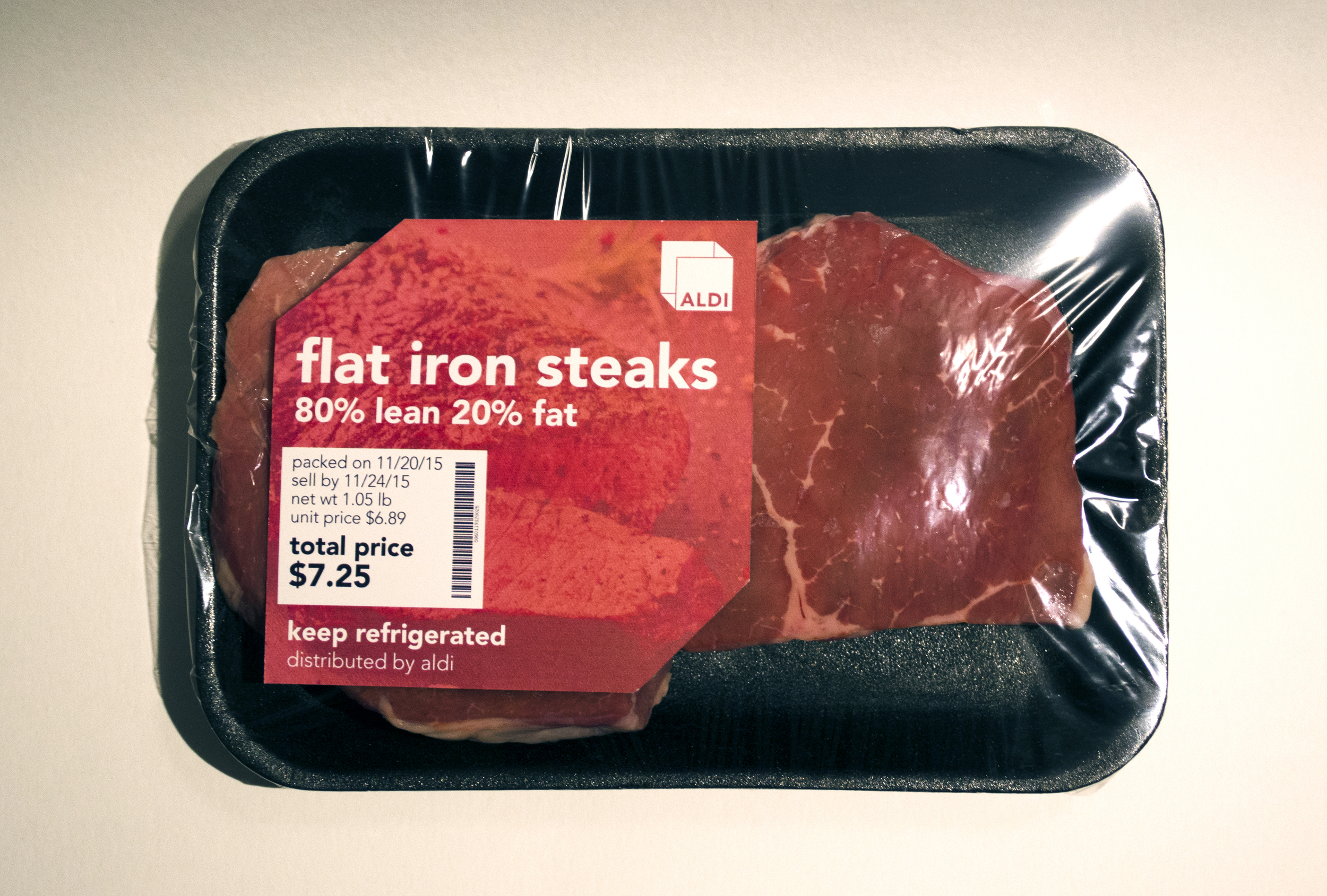
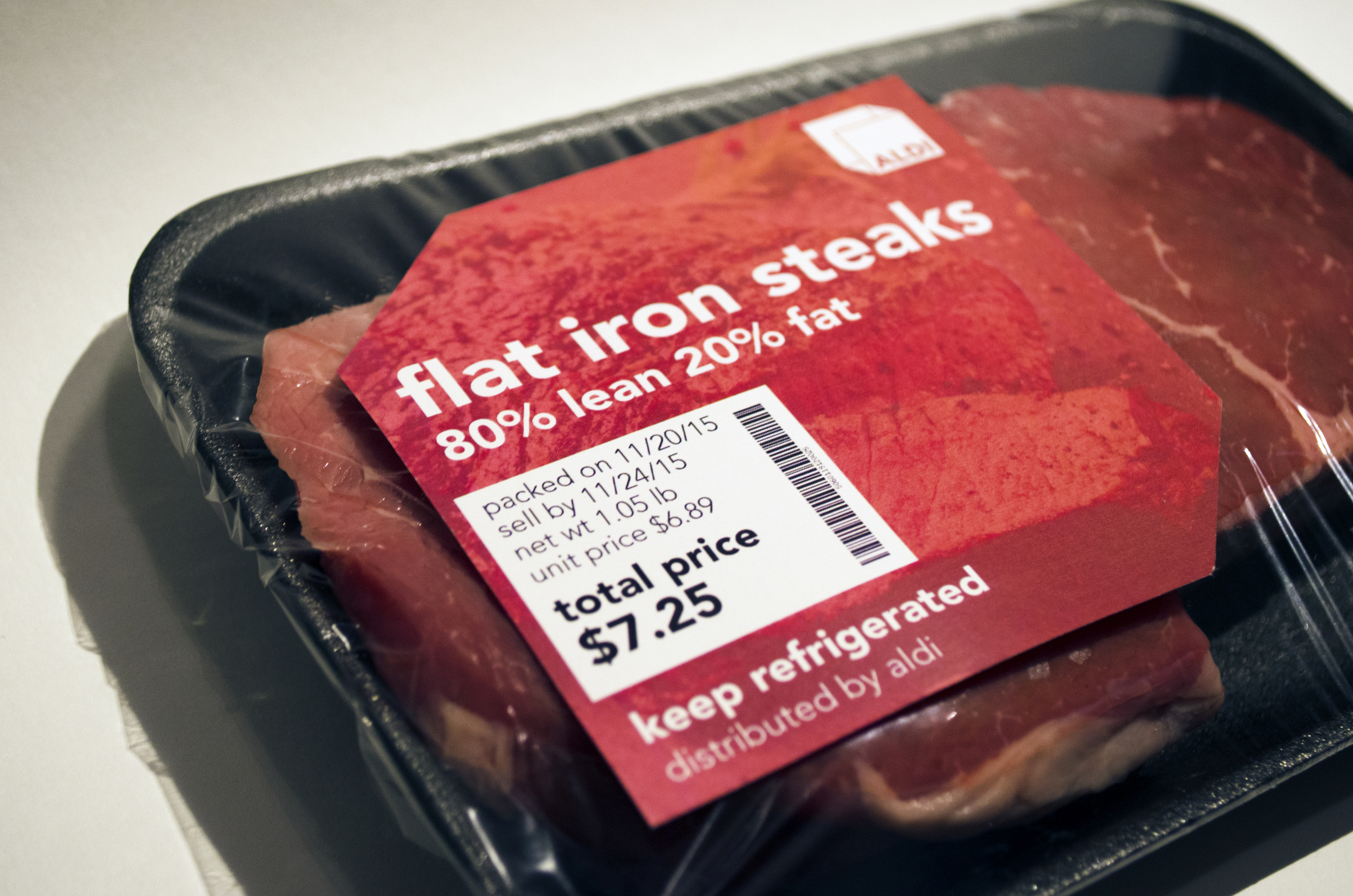
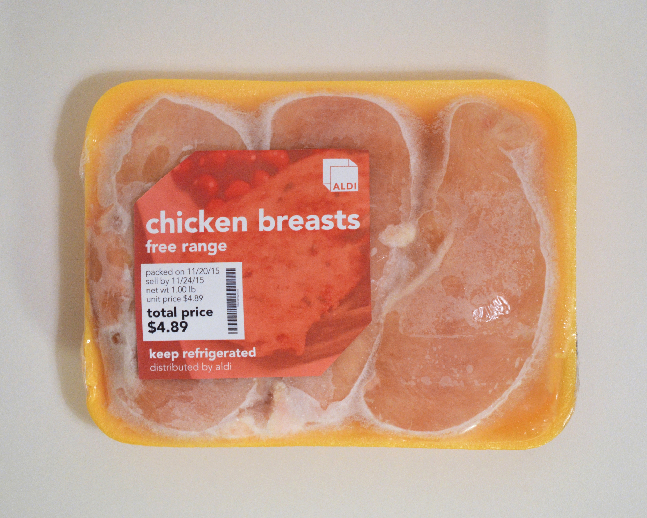
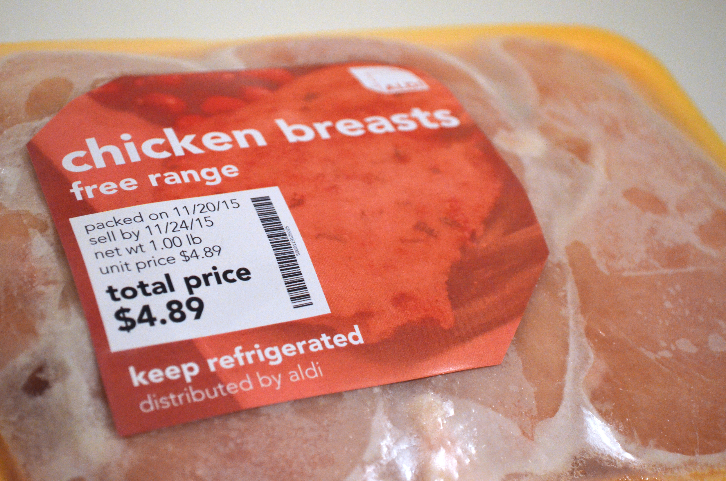
The new visual identity plays off the tagline with a flat abstraction of a box missing two sides. The color scheme supports the idea of expertise with a twist on primary colors. Red suggests appetite; yellow, freshness and approachability; and blue, wellness. Type consideration was focused around a kind of subtle boldness—something that was confident yet simple and straightforward.
Color overlays on photographs, large, detailed shots of food with interesting textures, abstracted shapes of the logo mark, strong grid systems with clean and simple typography, and specific color delineations are utilized throughout designs.