REBRAND, PACKAGING, RETAIL ENVIRONMENT & PROMOTION : MCCORMICK ESSENTIALS
Phase one for McCormick was to name a new line for the spice company — McCormick Essentials. I worked with a team to build a marketing strategy with the new name, which included a new target market of millennials just learning to cook on their own, developing a brand language and essence, and market and client research.
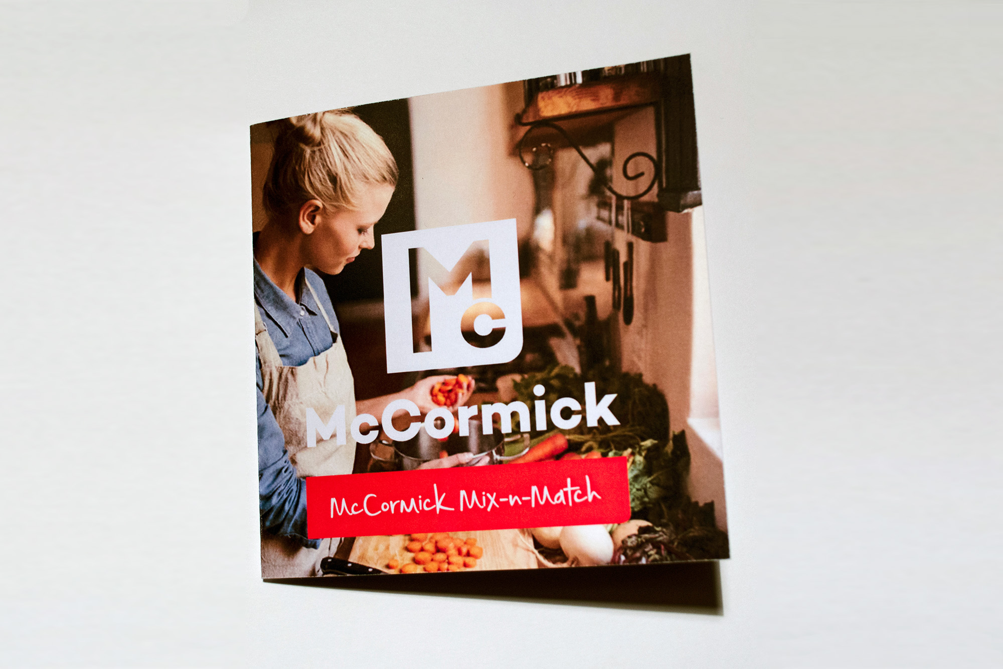
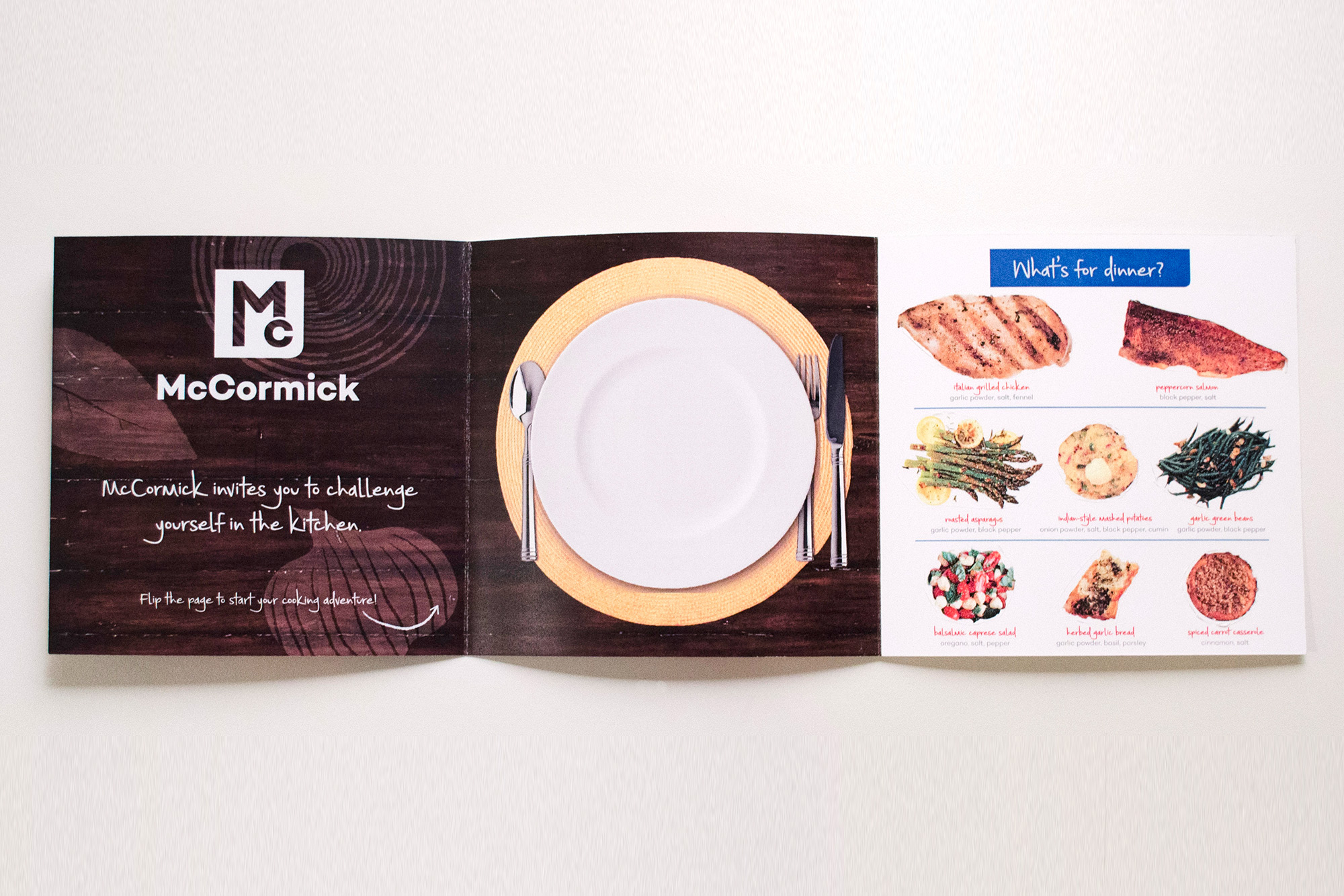
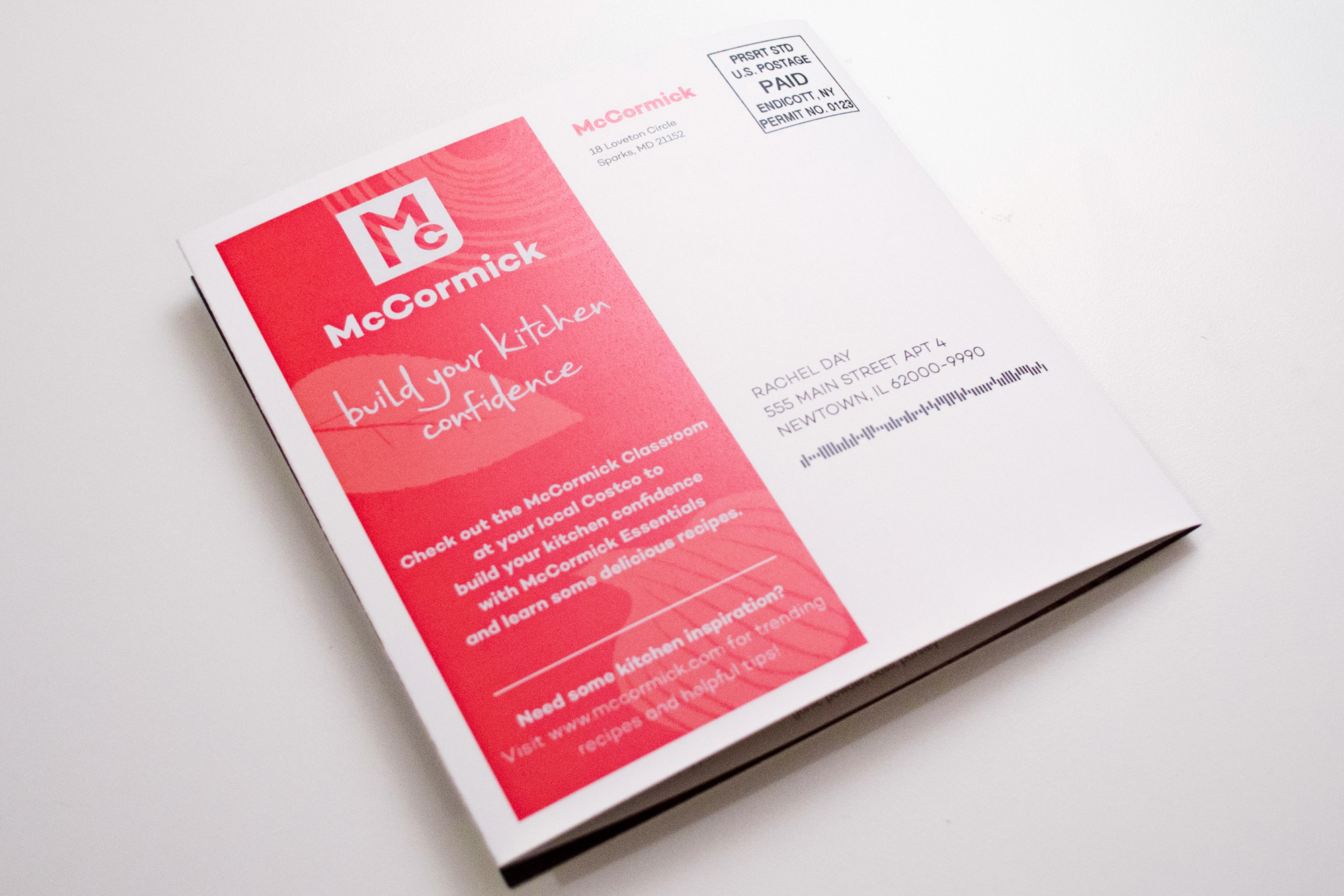
The second phase was to rebrand McCormick to successfully integrate our strategy visually in the logomark. Because my concept is to bring McCormick to a more youthful audience while keeping some integrity of the McCormick tradition, I broke the existing logo mark into the most basic elements to incorporate into logo design concepts. These elements include the square, ribbon, and iconic 'Mc'. I decided to modernize the 'Mc' and 'McCormick' with a round typeface and reflect that in the square element. The concept behind the mark is that the contrast of round and sharp corners are a kind of visual metaphor for how McCormick is the trusted, reliable brand that’s becoming friendlier and more inviting. At this stage, I also developed a tagline for McCormick: "build your kitchen confidence." It challenges, encourages and excites customers to take the plunge into the adventure that is learning to cook.
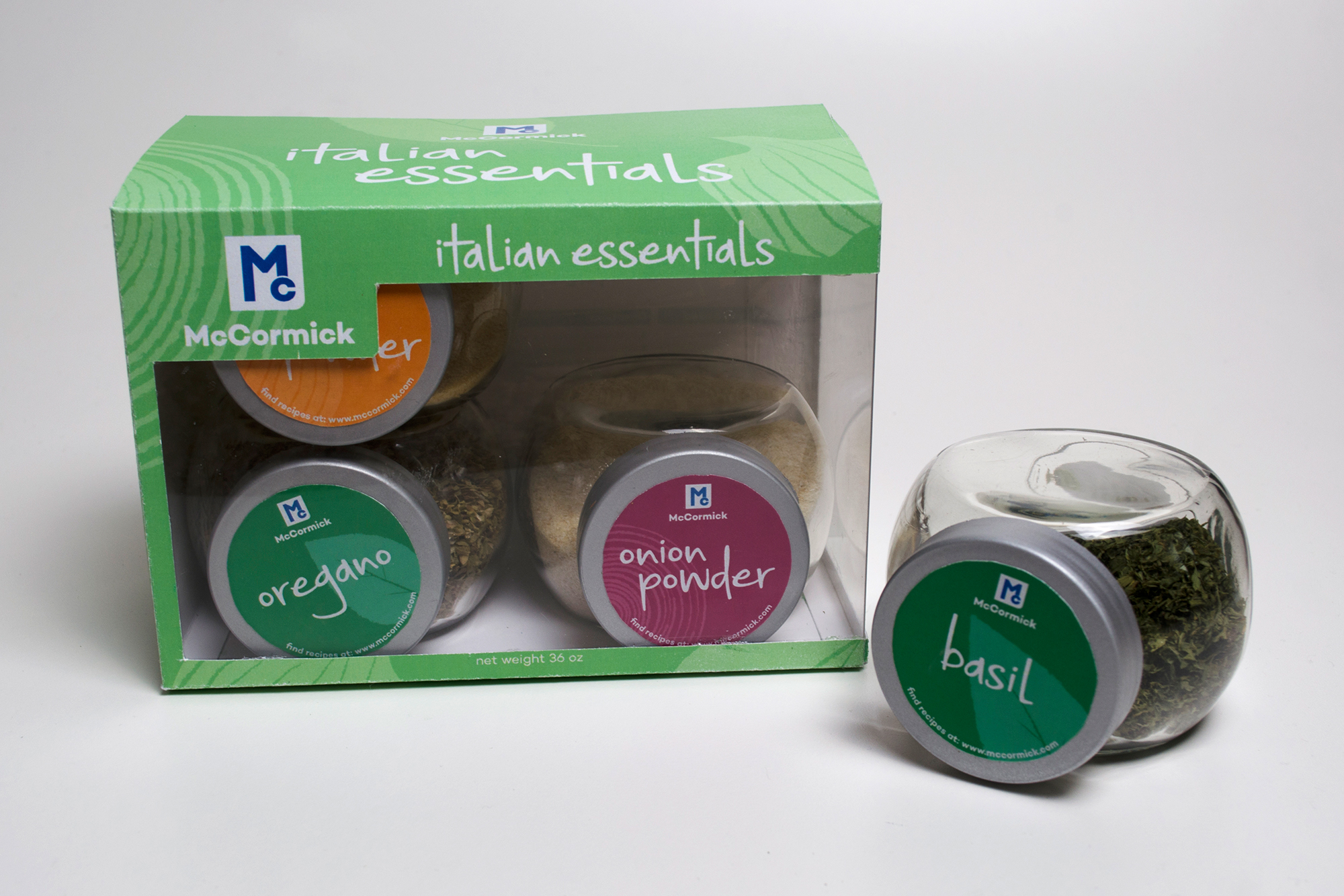
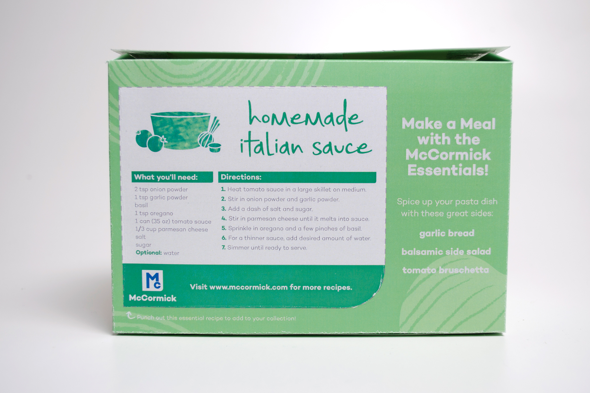
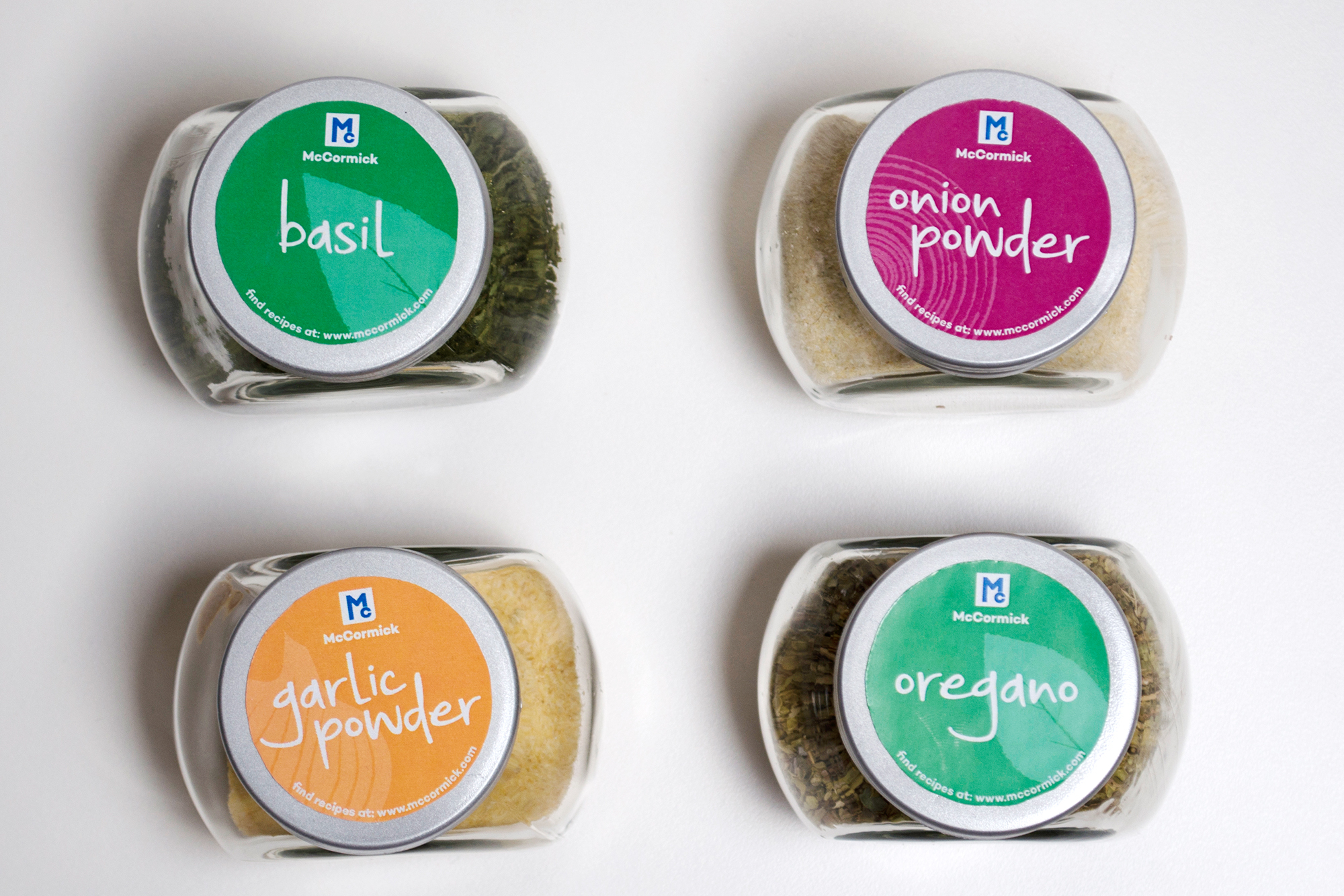
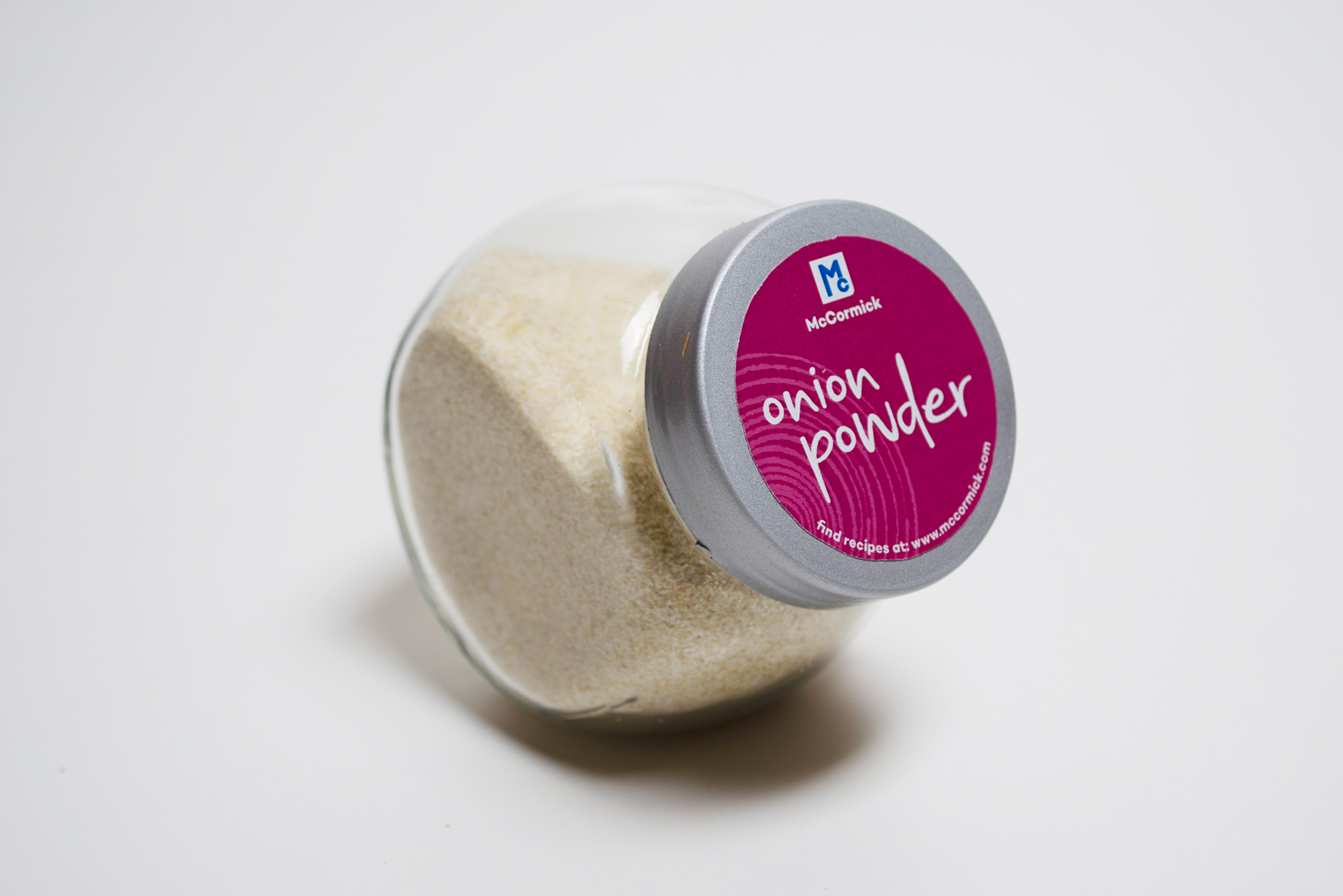
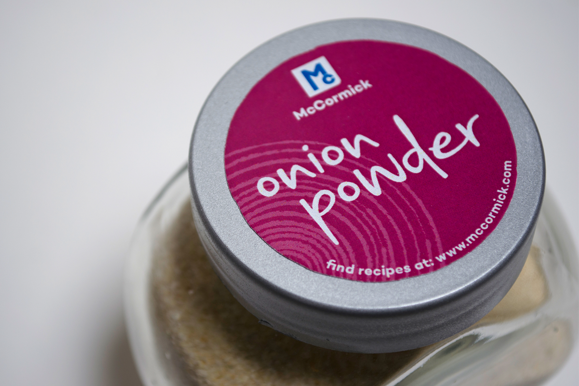
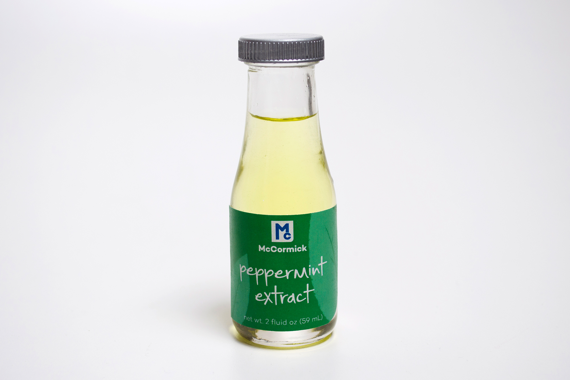
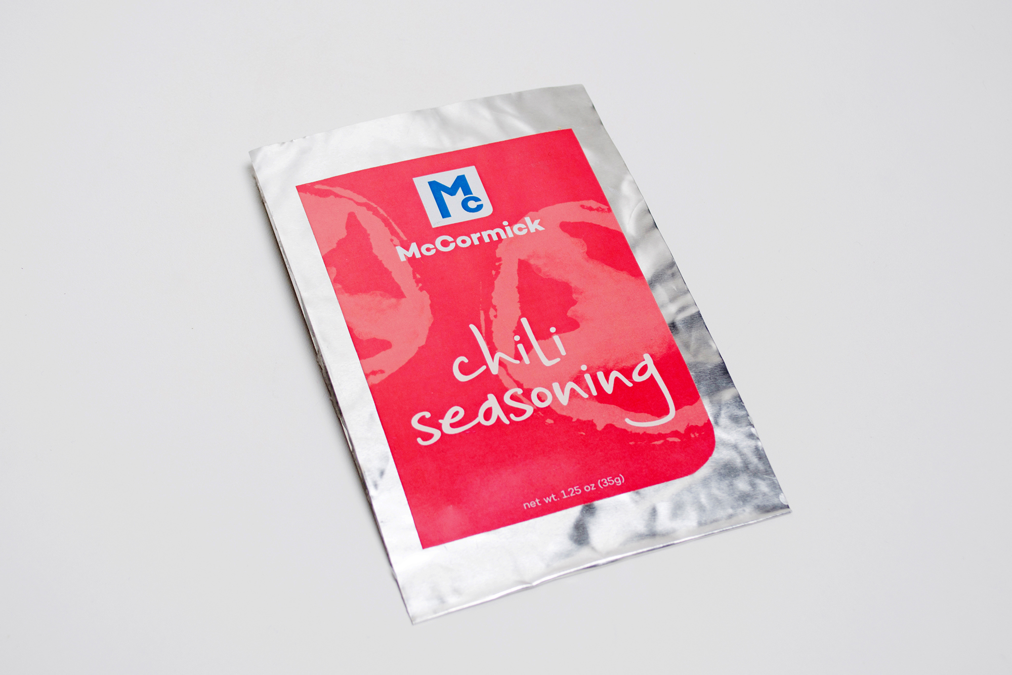
Phase three was to design packaging for the new McCormick Essentials line. Graphically, I employed a vibrant color palette, playful type, and large food stamped illustrations to attract the younger target market, as well as using the logomark's shape as labels. My concept was to incorporate stainless steel to represent the reliability of McCormick, glass to symbolize its transparency and allows the customer to see exactly what they're buying, and a kind of tangible interaction. Both the spice and extract bottles utilize the glass and tin materiality. They each are shaped in a way that's useful not only for merchandising but also for storage at home. The packet is made from pliable tin to give the package structure and features a recipe on the back to encourage customers to try something new. Finally, the McCormick Essentials starter kits were conceived to give customers an easier shopping experience. To eliminate shopping stress, McCormick offers themed starter kits (i.e: Italian, Oriental, Country Style), which housed four essential spices that are crucial to that particular theme. The kits feature the same kind of transparency and graphic qualities of the other packages, as well as offering a perforated recipe card on the back panel.
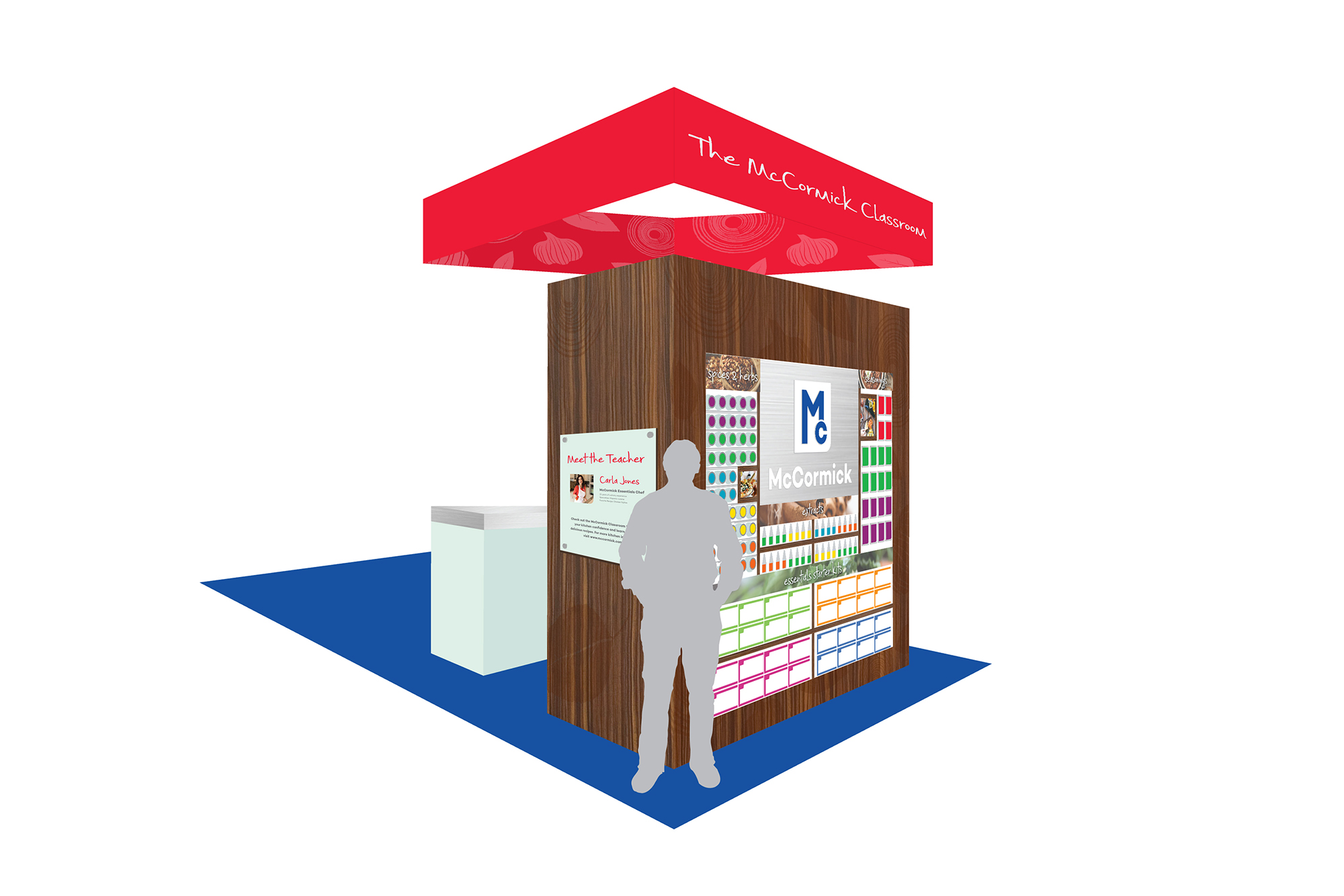
The fourth phase was to create a retail environment for this new McCormick Essentials line — the McCormick Classroom. My concept was to build a demonstration area that felt like a young and trendy kitchen that would be housed in stores like Costco or Sam's Club. The environment includes a large wall with a kitchen on one side and a product wall on the opposite side. The two sides are connected by the side graphics, floor application and overhead signage. Because McCormick is building customer's kitchen confidence, the demonstrations would be led by Essential Chefs who can answer questions and promote the line. Digitally, there is a screen mounted behind the demo area for a hit of brand recognition and display for taped demos when a chef is not present. An interactive tablet is mounted to the island for customers to search for recipes and tips. The product wall is impressive in how much product is displayed, and it features inviting and tasty-looking photography along with branded graphics. A dark oak was added to enhance the concept of the space feeling like it could fit at home.
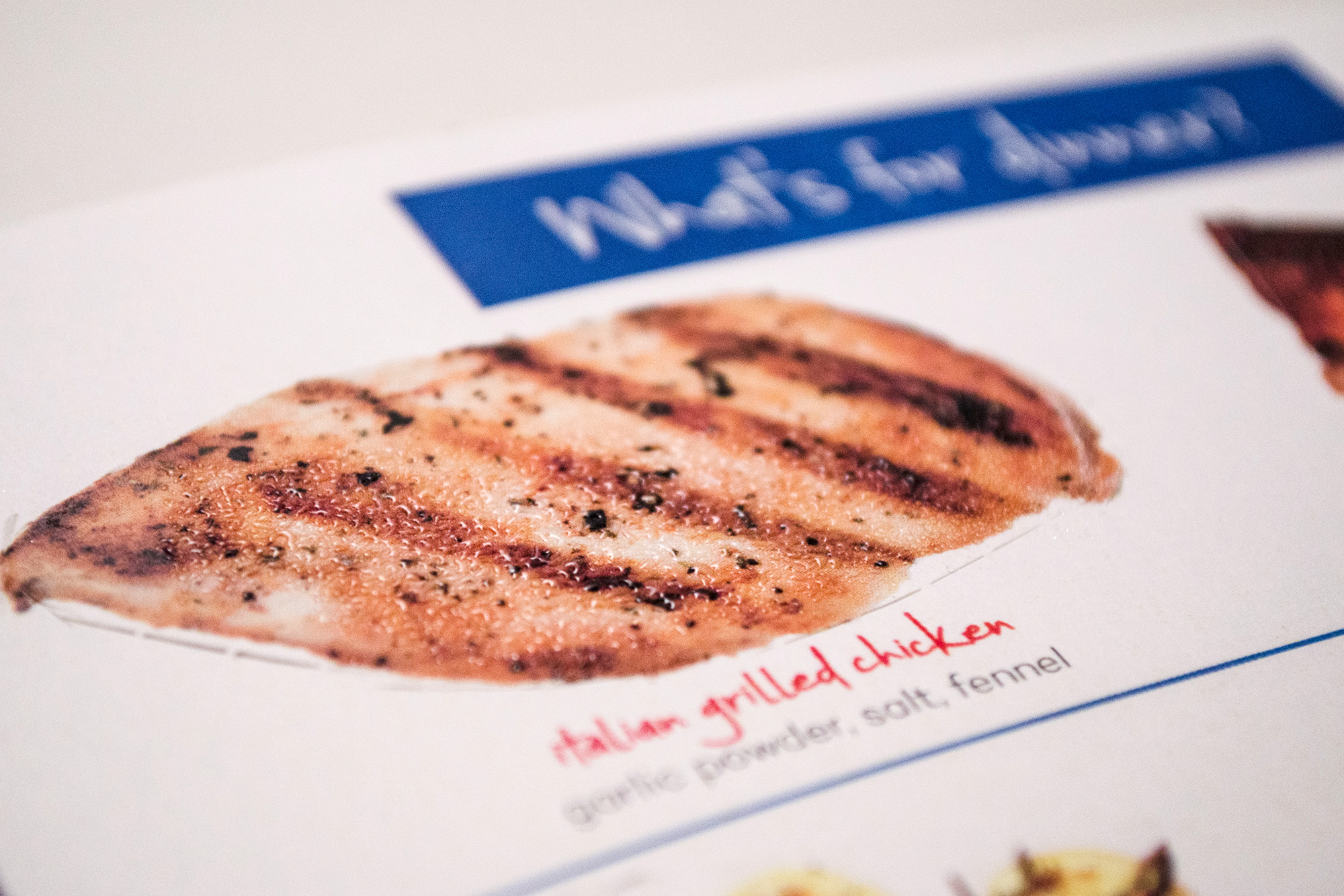
The final phase involved designing a promotional piece to reach the specific target segment — young millennials. I wanted to connect nostalgic memories of their childhood explorations with their present adventure into cooking. The promotional piece is a fold-out direct mailer featuring a variety of perforated, scratch & sniff dishes the user can pop out, smell the spices and build their own meal combinations.